Back again already?
6 AprilYou did it!
Congratulations, you made a single page app! Look at the person to your left, now look at the person to your right. Two of you blundered big-time and should have made a normal multi-page app.
At least your app doesn’t break the most basic of web-browsing functionality you get by default with normal multi-page apps, right? I’m talkin’ ‘bout links you can open in new tabs, a browser history with useful page titles, and a back button that, well, goes back. Right?
“What do you mean by goes back?” I hear you ask in my unrealistic imagination, somehow I’m a bit taller in this scenario, too.
Well, back in the 90s when a mommy browser and a daddy browser disagreed about how HTML, CSS, and scripting should work there was something they shared which brought them together. They found common ground with a special little button which could take the user back 1 page every time it was clicked.
This special little button made people feel comfortable about making mistakes. You see, people make mistakes. Not in a bad way, it’s a regular part of life.
This button was never controversial. Nobody said
“Hey, let’s make this button go back 2 pages per click”, or
“It should jump all the way back to the last top-level domain,” or even
“Who needs that? Our users only need to navigate forward.”
Those ideas would have been and are obviously ridiculous.
In light of recent events, here are the simple rules for back button behavior
Principle
Every time the user’s action takes them to a new place, the back button takes them back to the last place.
What is a place? It’s a view which users perceive as a place. There is no convenient definition like a “page” or “URL”, and that’s okay.
Setup
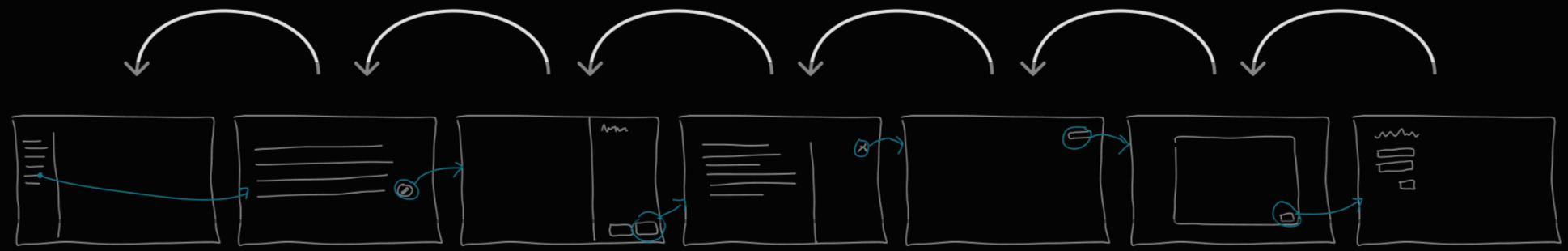
With any flow through the app, like this one:

Expectation
The back button is expected to do this:
*Caveat
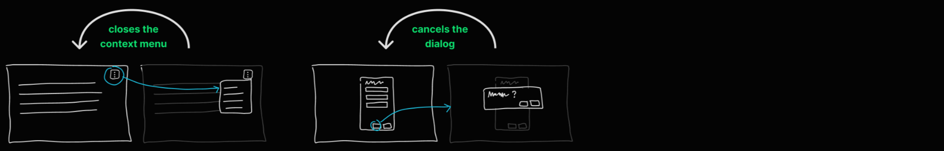
Sometimes things appear between places, but those aren’t “places” themselves. “Are you sure” dialogs and context menus are two examples of these things between places.
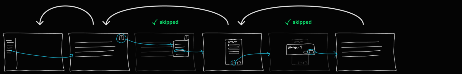
Nuance
When between places, the back button removes the between state first, then continues back as normal.
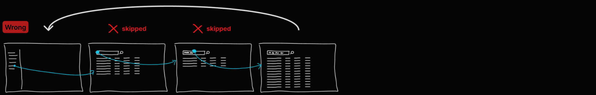
Failures
1
Don’t skip past places which happen to be styled as dialogs.

2
Don’t skip past preview panels, either.
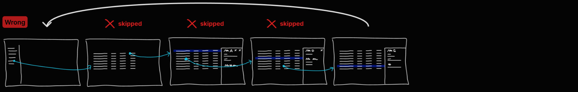
3
And don’t skip past searches or filter selections.
Test
If any users reasonably expect to see a particular view after using the back button, then that is a “place.”
Importantly, this doesn’t require all or even most users to have that expectation.
That’s how the web works by default
We have to actively do something to break it. But we don’t do that, right? That’s what the people sitting next to you do.
Software which punishes people for trying their best with high interaction costs by, e.g., mucking up the back button trains fear and inhibits their ability to learn how to use the software on their own.